

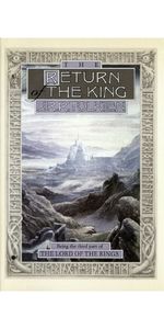
The Lord of the Rings
Product ID: 991778
Buy anything from 5,000+ international stores. One checkout price. No surprise fees. Join 2M+ shoppers on Desertcart.
Desertcart purchases this item on your behalf and handles shipping, customs, and support to Thailand.
Immerse yourself in Middle-earth with J.R.R. Tolkien’s classic high fantasy masterpieces behind the films... This special 50th anniversary edition includes three volumes of The Lord of the Rings ( The Fellowship of the Ring , The Two Towers , and The Return of the King ), along with an extensive new index―a must-own epic fantasy tome for old and new Tolkien readers alike. One Ring to rule them all, One Ring to find them, One Ring to bring them all and in the darkness bind them. In ancient times the Rings of Power were crafted by the Elven-smiths, and Sauron, the Dark Lord, forged the One Ring, a magic ring of immense power, filling it with his own power so that he could rule all others. But the One Ring was taken from him, and though he sought it throughout Middle-earth, it remained lost to him. After many ages it fell by chance into the hands of the hobbit Bilbo Baggins. From Sauron’s fastness in the Dark Tower of Mordor, his power spread far and wide. Sauron gathered all the Great Rings to him, but always he searched for the One Ring that would complete his dominion. When Bilbo reached his eleventy-first birthday he disappeared, bequeathing to his young cousin Frodo the Ruling Ring and a perilous quest: to journey across Middle-earth, deep into the shadow of the Dark Lord, and destroy the Ring by casting it into the Cracks of Doom. The Lord of the Rings , a timeless adventure novel, tells of the great quest undertaken by Frodo and the Fellowship of the Ring: Gandalf the Wizard; the hobbits Merry, Pippin, and Sam; Gimli the Dwarf; Legolas the Elf; Boromir of Gondor; and a tall, mysterious stranger called Strider. J.R.R. Tolkien (1892-1973), beloved throughout the world as the creator of The Hobbit , The Lord of the Rings , and The Silmarillion , was a professor of Anglo-Saxon at Oxford, a fellow of Pembroke College, and a fellow of Merton College until his retirement in 1959. His chief interest was the linguistic aspects of the early English written tradition, but while he studied classic works of the past, he was creating a set of his own. But can a simple hobbit resist the corrupting power of the One Ring and succeed where great warriors have failed?


| Best Sellers Rank | #43,198 in Books ( See Top 100 in Books ) #36 in TV, Movie & Game Tie-In Fiction #126 in Classic Literature & Fiction #350 in Epic Fantasy (Books) |
| Customer Reviews | 4.8 out of 5 stars 13,032 Reviews |
R**N
W**E
S**O
G**N
G**D
D**D
K**T
Z**I
C**R
C**1
A**A
L**I
F**G
Trustpilot
2 days ago
3 weeks ago